A licence to wear PINK!
Daniel Craig turned heads when he turned up to the No Time To Die premiere wearing a shocking-pink jacket. A statement piece in more ways than one, it was widely hailed as a break with Bond tradition. But the more we look, the more we find that this is hardly Bond’s first time wearing the most ‘feminine’ of shades.
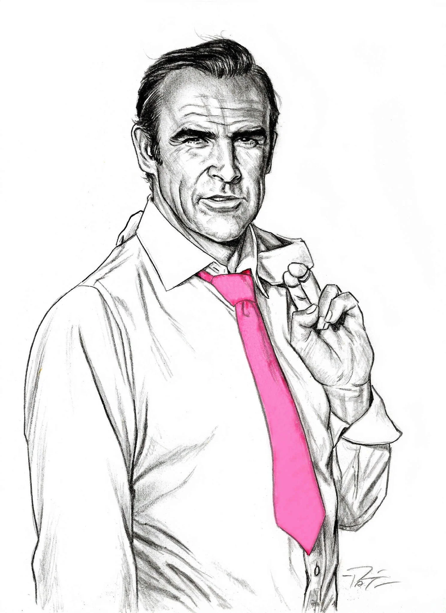
Art by Pat Carbajal
This article is also available as a podcast, wherever you get podcasts.
When someone chooses to wear pink there’s a strong chance they are making a statement about their identity. For many straight women, it may be something they do more or less unconsciously: they wear the girliest colour to reaffirm their femininity. For most men, it is probably more conscious. A straight man may do it to signal to onlookers that they are secure in their identity and unafraid to stand out from the crowd. Many gay and bisexual men may reach for the pink garments in their closet when they want to show the world their true colours (and stick to safer ‘masculine’ colours when they want to, or need to, blend in). Some of my lesbian friends refuse to wear pink because it’s inextricably tied in their minds to a very heterosexual brand of femininity. Trans Bond fan Jill Leflour told me he refused to wear anything pink while growing up because he felt an acute mismatch with anything feminine. Prior to coming out as gay I didn’t own a single item of pink clothing because I felt wearing pink things would give me away. Now I’ve gone completely the other way: my wardrobe (and sock, underwear and tie drawers) are full of pink things.

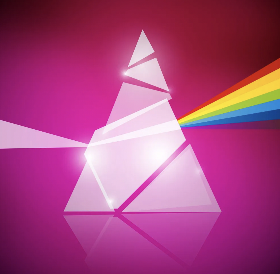
How can something as apparently innocuous as a colour be bound up with so many associations? Whatever else Pink! is, it is hard to ignore (hence my decision to go with a capital letter and an exclamation mark from the point onwards). It’s time to pass Pink! through the prism of Bond to find the rainbow on the other side and perhaps renegotiate our relationship with this often maligned colour.
A sabotage in cerise
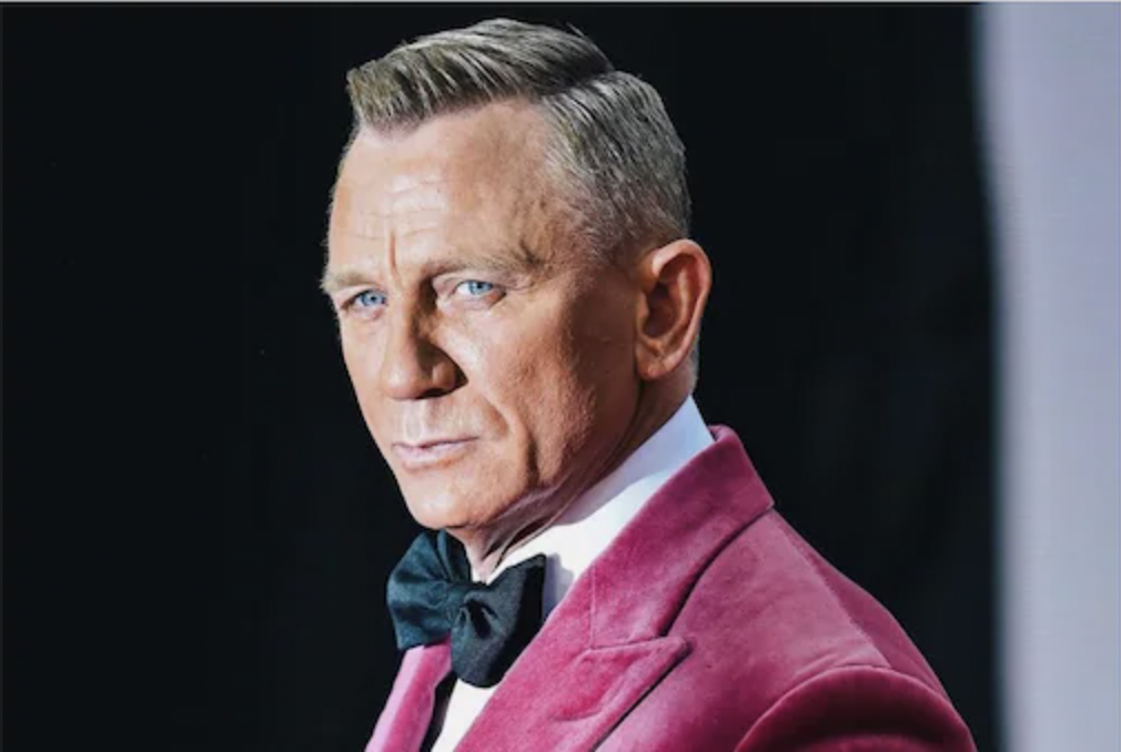
We should be wary of anything which tries to claim a social shift was caused by a single event. However, Daniel Craig appearing in a Pink! (specifically: cerise) jacket at the No Time To Die premiere could justifiably claim to be one of those events which, if not responsible for causing a shift to happen, at least catalysed something.
The day after the premiere, the Evening Standard asked their readers:
“Thought a man wearing pink was no longer cause for commotion? Think again.”
But, as they pointed out themselves: “this wasn’t any man. It was James Bond.”
The Guardian’s fashion editor, Priya Elan, succinctly joined the dots between Pink!, masculinity and Bond: “stripping James Bond, our most masculine icon, of his black tux and instead going for a suit jacket in a colour historically associated with femininity is an act of subversion, but also sabotage.”
Interviewed by Elan, Professor Andrew Groves (the director of the University of Westminster’s Menswear Archive) was adamant that Craig’s stylistic departure was intended to loudhail Craig’s own departure from the role: “The shocking-pink tailoring makes it patently clear that he no longer wants to be seen as James Bond.”
Tabloid journalist Piers Morgan tweeted some typically toxic narrow-minded twaddle:

In Morgan’s fragile conception of masculinity, wearing Pink! was incompatible with being a “steely-eyed assassin”.
Not that the public paid much attention to Morgan. The Independent reported that Craig’s wearing of Pink! caused the demand for such jackets to skyrocket.
Whether you were in favour of Craig’s sartorial decision or not, the consensus was that Craig wore Pink! to make a clean break with the role he had been playing for the preceding 15 years. And yes, it was a bold choice. His Bond does not wear anything that colourful in his five films. Bond wears blacks, greys, tan shades and blue. Lots of blue. Fleming’s Bond is a fan of blue, Connery wore an iconic blue Turnbull & Asser shirt in Dr. No and the filmmakers doubled down on the blue for Craig’s Bond. It was a decision motivated by his ‘steely’ blue eyes, according to Casino Royale’s costume designer Lindy Hemming. Subsequent designers continued the trend established by Hemming.
But Bond wearing Pink! was not a completely new thing and was arguably set in motion nearly sixty years before, with Connery’s Bond being especially fond of the colour.
You Only Pink! Twice (or more)

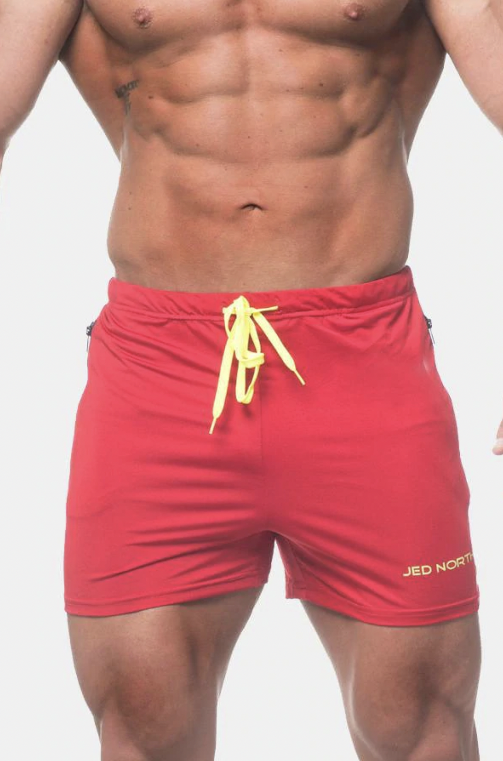
In Thunderball, Connery not only wears a Pink! shirt when he meets Domino on the beach but later pulls on - then off and then, post-coitally, on again - a pair of Pink! shorts. The only threat they pose to Connery’s masculinity is their blood-constrictingly tight fit: they are VERY short shorts. The pair recreated by Orlebar Brown in 2020 (colours: ‘warm Pink!’ and ‘watermelon’) lists the inside leg length as only 4.5 inches, half an inch shorter than the 5 inches which was already considered daring by many in 2020, back when Esquire, Vogue and others reported that men were being pressured by (mostly female) TikTokers into buying ever-shorter shorts. Although all fashions burn themselves out eventually, #5inchseam shows no signs of slowing down. At the time of writing, TikTok videos featuring the hashtag have nearly 40 million views. While a minority of male TikTok users consider the look to be ‘gay’, many - regardless of sexual orientation - have embraced it, although combining a short inseam with the colour Pink! appears to go beyond metrosexuality for the majority. It seems wearing a pair of Pink! shorts is more gay than wearing a pair of short shorts. It seems that straight men feel more exposed by the colour than they do the fit.
I can’t help thinking more men would have been more open-minded had Daniel Craig’s Bond strayed further away from his muted colour palette. Even in No Time To Die - in which he wears another very short pair of shorts - he goes for navy blue, despite Jed North producing them in a range of shades, including a fetching crimson red (maybe a bit too Baywatch?)
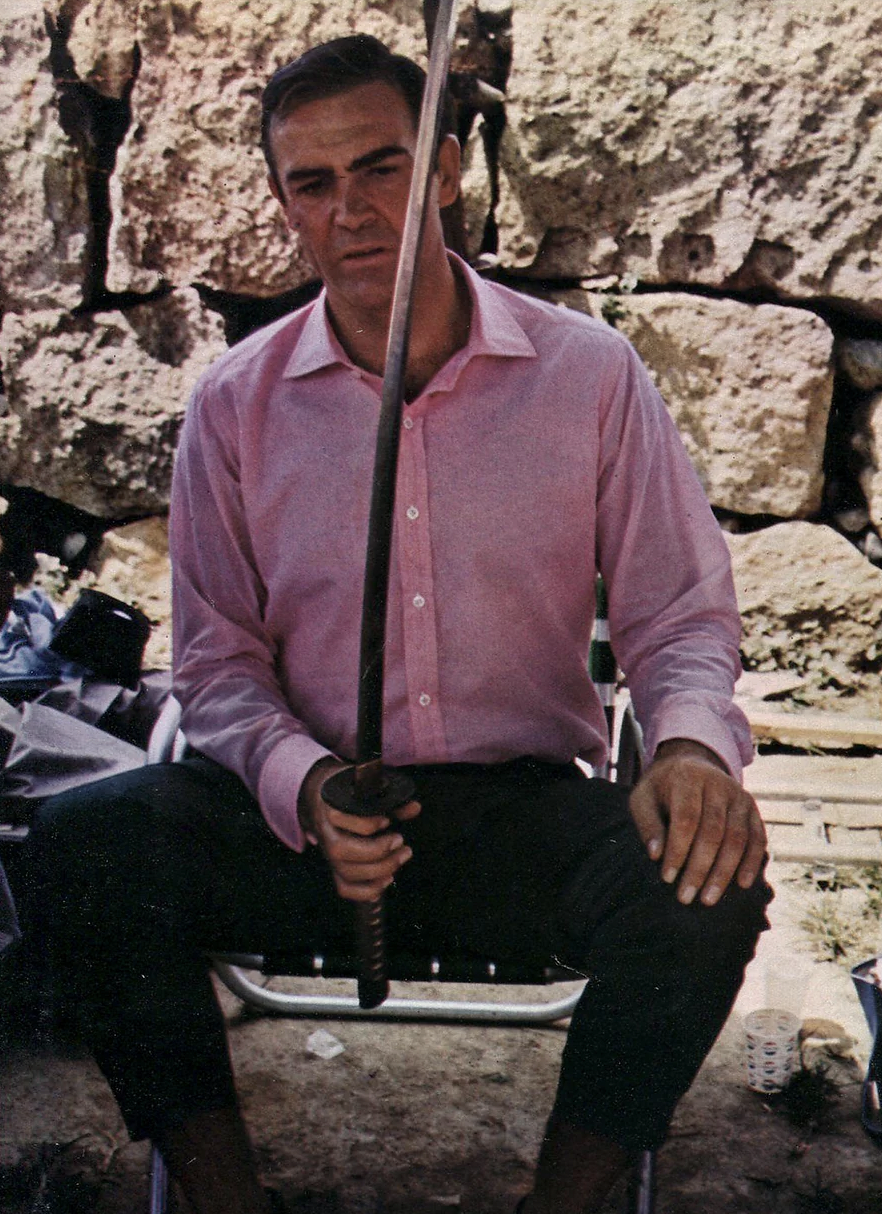
While straight men may feel more sensitive about their bottoms, I have seen more of them willing to experiment with Pink! with their tops. Again, Connery got there first. In You Only Live Twice he donned a Pink! linen shirt made by Turnbull & Asser, who also made that iconic blue shirt for Dr. No. Although the story of the film of You Only Live Twice is not as obviously a Rebirth story as the novel’s is, it makes sense for Connery to wear something less conventional when he’s operating outside his usual European or American milieu. Pink! has the added bonus of absorbing less light than blue or black, making it a more pragmatic choice for a sweltering Japanese summer.
Lazenby continued the Connery trend, albeit fleetingly. Although On Her Majesty’s Secret Service’s signature colour is purple (a colour with thousands of years of queer associations) it does feature some Pink!. In the scene where Bond checks into his Portugal hotel, he pairs a cream suit with a light Pink! shirt. Faithful as this film is to the book, the filmmakers missed the opportunity to put Bond in a pink parka, as Fleming had, which he borrows from Tracy to aid their escape from Blofeld’s goons.

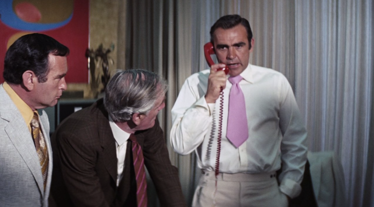
When people think ‘Pink!’ in relation to Bond their mind probably goes straight to the conspicuous tie Connery wears when infiltrating Willard Whyte’s compound in Diamonds Are Forever. A fair criticism is the tie’s exceptionally short length, although it’s not uncommon to hear straight men condemning the selection based on colour alone. [As a sidenote, there’s perhaps a whole Freudian thing here about men feeling self-conscious about wearing anything ‘too short’, which I shall nonchalantly sidestep to save the blushes of all concerned…]
When I hear anyone condemning the colour Pink!, I can’t help thinking of Tarantino’s Reservoir Dogs, where Mr Pink bemoans his nomenclature:
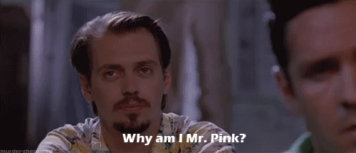
Mr. Pink!: Hey, why am I Mr. Pink!?
Joe: Because you're a faggot, alright?
Mr. Pink!: Why can't we pick our own colors?
Joe: No way, no way. Tried it once, it doesn't work. You get four guys all fighting over who's gonna be Mr. Black, but they don't know each other, so nobody wants to back down. No way. I pick. You're Mr. Pink!. Be thankful you're not Mr. Yellow.
Mr. Brown: Yeah, but Mr. Brown, that's a little too close to Mr. Sh*t.
Mr. Pink!: Mr. Pink! sounds like Mr. P*ssy. How 'bout if I'm Mr. Purple? That sounds good to me. I'll be Mr. Purple.
Joe: You're not Mr. Purple. Some guy on some other job is Mr. Purple. You’re Mr. Pink!.
Mr. White: Who cares what your name is?
Mr. Pink!: Yeah, that's easy for your to say, you're Mr. White. You have a cool-sounding name. Alright look, if it's no big deal to be Mr. Pink, do you wanna trade?
While the bank robbers in this scene are hardly representative of wider society (they are, after all, a bunch of not terribly enlightened hoodlums) the exchange highlights how many different colours, not just Pink!, have specific social meanings.
We might laugh, uncomfortably, at Joe’s apparent homophobia (the use of the word ‘faggot’ inclines me to think he might not be a vocal champion of diversity in the workplace) and also Mr. Pink!’s misogyny. But at least Tarantino explicitly addresses the Pink! elephant in the room: the colour is connected with gayness and femininity (via a woman’s genitalia). But why is this case? And to what extent is it a relatively recent thing?
In (and out of) the Pink!
There are lots of arguments from different academic disciplines, from physics to evolutionary biology, that attempt to explain why certain colours become associated with particular things. However, they all have their limitations - and exceptions. For instance, while red commonly signifies danger (perhaps because it’s the colour of spilled blood), this is not universal across all cultures (many warning signs are yellow in China). While many cultures use black to signify death, Buddhists associate white with death.
Colours are like words: their meanings are not fixed and they can shift over time, although - as it is with words - the process is usually very slow. Words like ‘gay’ are rare: it’s almost unheard of for a word to acquire not just one, but two, completely new senses (homosexual; rubbish) which are widely used across a population within the lifespan of a human being. The process usually takes centuries.
The word for the colour ‘Pink!’ has only been in the English language for around three centuries, although it had been used with a completely different sense for half a millennium prior (The verb ‘to Pink!’ was a synonym for ‘stab’ and it survives today with that meaning in ‘Pink!ing shears’). Prior to ‘Pink!’ being coined, people referred to anything that was Pink! as ‘light red’, the way people in Chaucer’s day referred to foxes as ‘yellow-red’ because English-speakers hadn’t seen an ‘orange’ yet (the colour being after the fruit).
In the same way that the colour orange was named after an object which was that colour (the fruit), the word Pink! came into being to describe a thing which was Pink!-coloured: a type of flower. With flowers being associated with femininity in many (but not all) cultures, it might be tempting to argue that ‘Pink!’ has always been inherently feminine. But it’s not as simple as that.
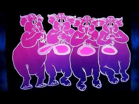
Considering its origins lie in the natural world, it’s surprising that Pink! has sometimes been used to suggest something is unnatural. For more than a century, people have been using ‘seeing Pink! elephants’ as a euphemism for getting roaring drunk (Pink! elephants DO exist in nature but they are very rare). ‘Seeing Pink! elephants’ was a favourite phrase of the writer Jack London (words are appropriated from London for the eulogy of another famous alcoholic - Bond - in the novel of You Only Live Twice and film No Time To Die).
After a video claiming that Pink! doesn’t exist in nature because it’s a combination of red and purple went viral in 2011, the physics editor of Scientific American stepped in to defend Pink!, rejecting any attempt to declassify Pink! as a colour in the same way ‘Pluto’ had lost its classification as a planet. He concluded that all colours are made up because they’re all in our mind. Pink! is no different in this regard.
As anyone who has seen a rainbow can attest, red and purple are on opposite ends of the colour spectrum. This is reflected in the LGBT pride flag designed by Gilbert Baker in 1978. Now missing from Baker’s original design is the Pink! strip. Pink! was simply too expensive to reproduce en masse so it was dropped. Each colour on Baker’s original flag had an intended meaning. He specified that the Pink! (technically ‘hot Pink!’) should represent sex.

Despite the absence of Pink! on the LGBT pride flag flown most commonly today, Pink! has a considerable queer pedigree, although it’s not always been a pleasant association.
The Nazis made gay men, lesbians and trans women wear a Pink! triangle in the same way they made Jewish people wear a yellow Star of David. If you were both Jewish and queer, you had the Pink! triangle placed over the yellow Star of David. San Francisco’s Pink Triangle Park honours the gay victims of the Nazis and there are monuments featuring Pink! triangles in Amsterdam, Sydney, Berlin and Buchenwald (a camp where many gay men were experimented on and killed).
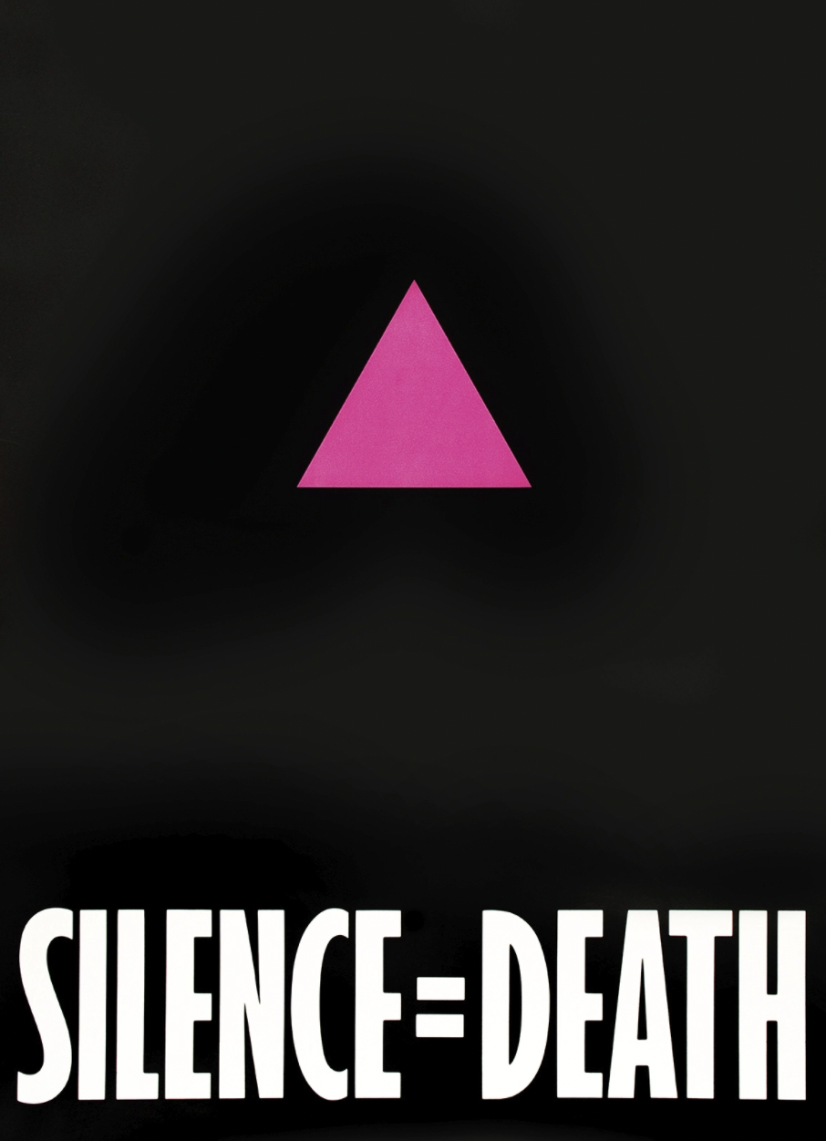
The Pink! triangle used by the Nazis has now been reclaimed by the queer community. The first recorded instance of the Pink! triangle being worn by gay rights activists is from 1977. As AIDS ravaged gay communities in the next decade, the organisation ACT-UP adopted the Pink! triangle (turned on its head) as their symbol. More recently, Pink! triangles have been worn by those protesting against Russian persecution of queer people.
And Pink! is featured on several of the more recent queer pride flags, including those representing lesbians, bisexuals and pansexuals. It features prominently on the transgender flag (designed by Monica Helms in 1999). Here Pink! is used because it is traditionally associated with girls. Alongside is its binary opposite, blue (traditionally associated with boys). White runs through the middle, representing those who don’t identify as either.
“More decided and stronger”
It’s a common claim that there was a dramatic reversal in Pink! and blue with there being a period of history where only boys wore Pink! and girls wore blue. It’s called, funnily enough, the ‘Pink!-Blue Reversal’ (or PBR for short). While the evidence we have suggests that this is an overstatement, the association of the colours with different sexes was not always as fixed as it is today.

In her book, Pink! and Blue: Telling the Girls From the Boys in America, historian Jo Paoletti explores how Pink! and blue were used inconsistently for children’s clothing until after the Second World War. She cites a textiles trade publication from 1918: “Pink! being a more decided and stronger color, is more suitable for the boy…” And a few years before that, Paoletti found a newspaper had advised the following: “If you like the color note on the little one’s garments, use Pink! for the boy and blue for the girl, if you are a follower of convention.”
This means that Fleming’s Bond, and Fleming himself, could well have been swaddled in Pink! baby clothes, both men having been born before the Second World War.
However, following the social dislocation of the War, men and women were expected to slot back into more rigidly defined roles. Jobs which women had taken on through necessity were given to returning servicemen. Advertising and other media imagery reinforced the dichotomy of stay at home mums and off-to-work dads. Everything was marked for gender, including clothing. As Paoletti says, “The more you individualise clothing, the more you can sell.”
Simply put, people bought into the idea that Pink! was for girls and blue was for boys because of what they were being told to buy. Manufacturers and marketers sold more by making people’s minds up for them and removing indecision.
While this can lead some to feel less anxious about making the ‘wrong’ decisions, it can have very damaging effects on others. Experiments have repeatedly shown that people treat babies according to what colour they’re wearing. In these experiments, anyone wearing blue - whether they’re a boy or a girl - is assumed to be a boy and is encouraged to play more challenging games. Anyone in Pink! gets molly-coddled and a doll to play with. Most of us were hardwired with gender expectations before we were even born, based on the bedroom wallpaper, clothing and myriad other things our parents bought for us. Other experiments have looked at children’s colour preferences over time in order to pinpoint when we become aware of our gender. We show a preference for blue or Pink! by the age of two and most boys reject Pink! by the age of four. Appearing in a 2019 issue of the journal Nature, a metanalysis of papers from a wide range of disciplines concluded that there are some differences in how men and women process colour information but these could mostly be explained by cultural factors. For instance, the stereotype that women have a richer colour vocabulary (e.g. rather than say Craig’s jacket is Pink!, a woman might be expected to say it’s cerise) is unlikely to have a biological basis: there’s a social expectation that women will be more precise when naming colours. For a man to use such ‘fancy’ terms would be seen as ‘unmanly’.

Some of us don’t have the luxury of fitting into socially-determined boxes and, when we do try to fit ourselves - round holes in square pegs - it causes intense discomfort.
We might take some comfort, at least, from history. Writing in Mr Porter in 2021, Adam Welch says that “the lack of vibrancy in the typical male wardrobe is a decidedly 20th-century invention.”
…
“It’s not at all true to say that, when it comes to style, colour is inherently unmasculine. Were we living and breathing as recently as 200 years ago (fingers firmly pinched around nostrils, probably), we’d find that some of the most-admired male dressers of the day were stalking around in brightly coloured frock coats, embroidered in dazzling threads of rainbow hues.”
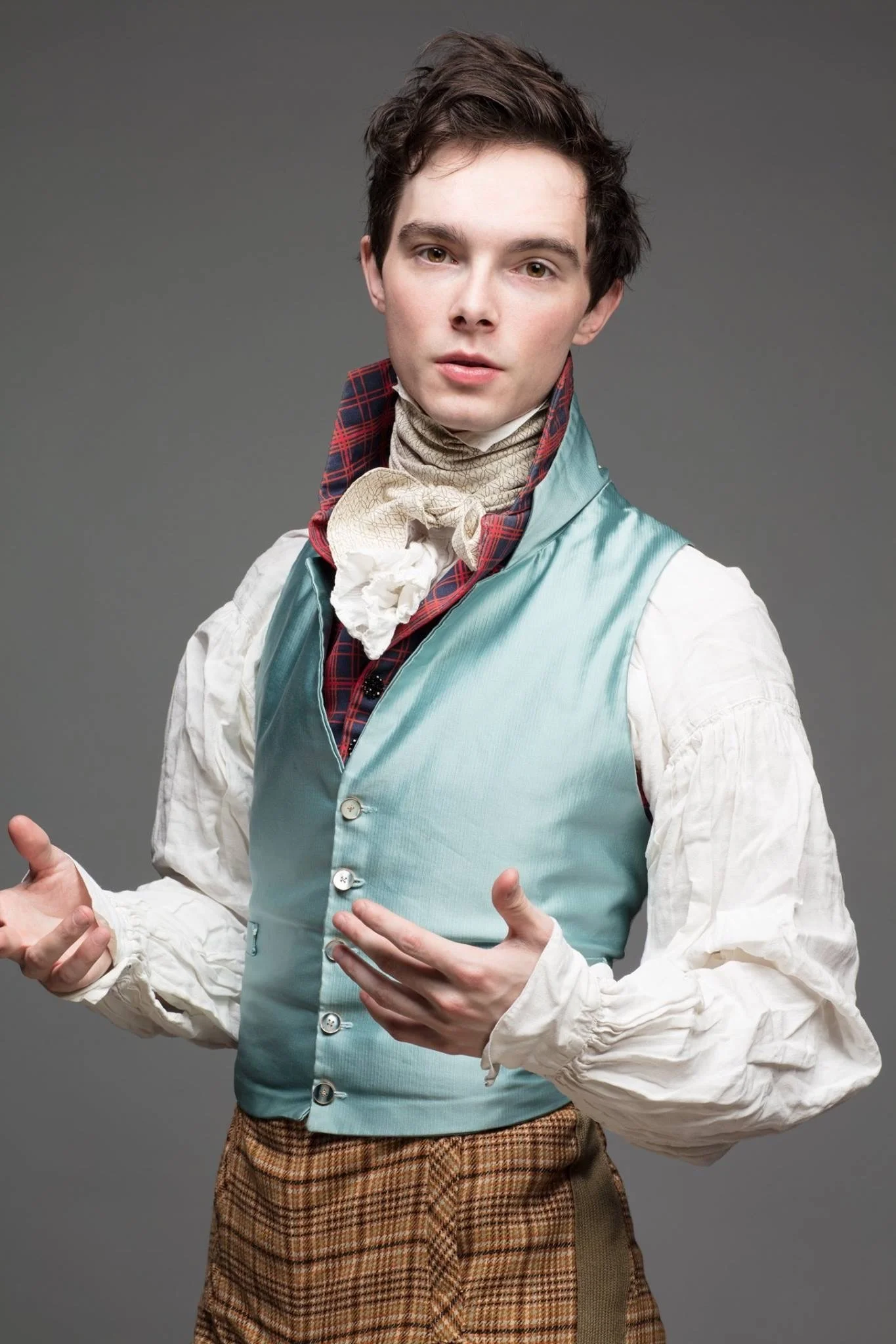
Image copyright Zack Pinsent
Pink! highlights and Champagne
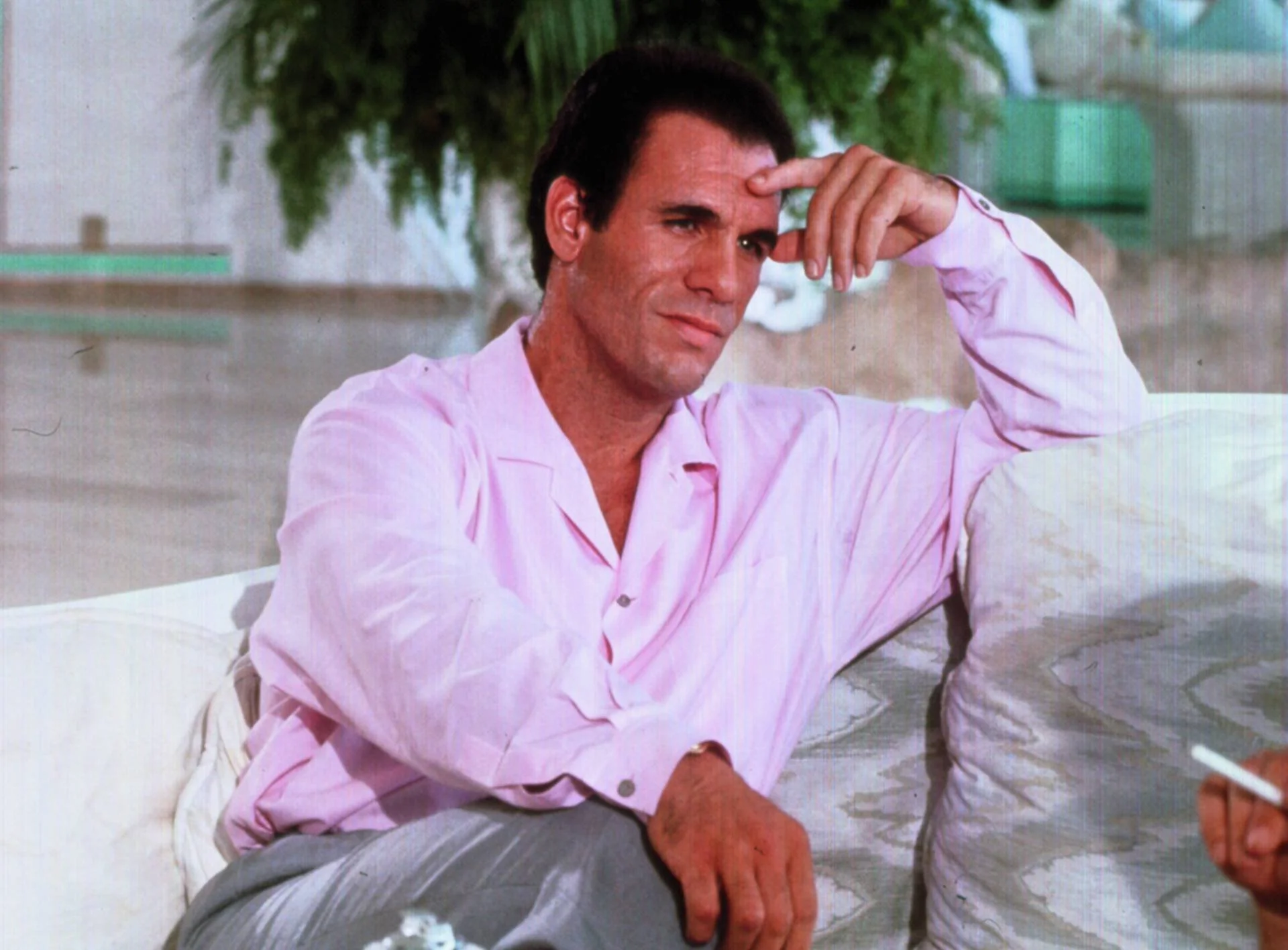
As Bond fans, we are accustomed to taking lifestyle inspirations from our favourite character, so why not follow his Pink! example? True, the films have been relatively Pink!-phobic in recent decades. Robert Davi, who played Licence To Kill’s villain, wore a Pink! shirt prominently in order to further hint at his character’s homoerotic possibilities, although we probably wouldn’t feel terribly comfortable citing Sanchez as a role model!
But those three Connery films in a row (with a Lazenby in-between) are perennially Pink!, reminding us of their Pink!ness every time they are replayed. And the Bond of Fleming’s books is very drawn to Pink! things, especially alcoholic drinks.

He drinks an awful lot of Pink! Champagne, especially when impressing lady friends (Tiffany Case, Mary Goodnight, Mary Ann in From A View To A Kill). But he’s more than happy to share a glass with Mr Du Pont in Goldfinger and the promise of Pink! Champagne is one of the few highlights of an otherwise deeply distressing fishing trip with Milton Krest in The Hildebrand Rarity. Intriguingly, both of the short stories mentioned above employ Pink! for plot purposes. In From A View To A Kill, the enemy mark their hideout with a “single Pink rose”. It’s this which gives them away to Bond. And the titular fish, the Rarity itself is “bright Pink with black transverse stripes. The anal, ventral and dorsal fins are Pink!.” Are we to draw the conclusion that, in Bond’s world - as in ours - Pink! makes you conspicuous?

So why does Bond order a Pink! drink when ingratiating himself in Scaramanga’s company in The Man With The Golden Gun? Surrounded by Scaramanga’s assembled gangsters, he asks for “Plenty of bitters” in his glass of Beefeater gin before getting into a discussion with the bartender about “the relative merits of gins”. Is he trying to tell Scaramanga something?
Speaking of Pink! gin (and who needs an excuse? It’s divine!) Mary Goodnight wears a “frock” in The Man With The Golden Gun which is the exact shade of “Pink! gin”. Near the end of his life, Fleming clearly had Pink! on the brain. It has to be said that only Fleming’s women wear Pink! clothing. The list includes Goodnight’s secretarial predecessor Leolia Ponsonby, Gala Brand, Tiffany and Tracy, the last of who wears a lot of Pink!, catching Bond’s eye from the moment he sees her. So Pink! = femininity in Fleming’s world? Well, perhaps. But it’s probably more accurate to say Pink! = femininities (plural). When From Russia, With Love’s Rosa Klebb attempts to seduce Tatiana, she shows off her Pink! underwear. The book’s Klebb is not a lesbian like the film’s but rather a “neuter” who enjoys sex with men and women but no romance (perhaps ‘aromantic’ might be a more appropriate modern label).
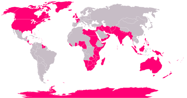
What really excites Klebb is her work, which includes bringing British Intelligence into disrepute. Fleming tells us “her wet lips parted” when she saw the “Pink! shape on the wall-map that was England”, a reminder that Pink! was the colour used to represent the British Empire on maps for two hundred years. This was so text could be overlaid and easily distinguished, as the originally-chosen colour was red, which reflected the red uniforms of British soldiers but was impractical for readable maps. Presumably though, Pink! was not such a feminine colour in the 19th Century (or at least not consistently so) so no one objected to denoting Britain’s armed forces with the colour.
A particularly interesting use of Pink! to help tell a story is the business with the haiku in Fleming’s You Only Live Twice. When Tiger Tanaka’s operative is discovered clinging onto life, his final words are a haiku poem: “Desolation! Pink dragonflies flitting above the perfumed graves." Bond later sees these Pink! dragonflies for himself when he infiltrates Blofeld’s garden of death. One of these dragonflies made it onto the first edition cover art by gay artist Richard Chopping (although it was recoloured blue, perhaps to contrast with the pink chrysanthemum).

When Bond makes the connection with the dead agent and the pink dragonfly he concludes that “That was the last nightmarish touch to this obscenity of a place.” Pink! is here associated with something perverse and horrifying, along the lines of the “Pink froth” on the mouths of the troops pretending to be poisoned in the novel of Goldfinger.
Pink! still possesses the power to shock, or at least be off-putting to some men. I feel a bit sorry for such men. I used to be one of them - or at least, I used to pretend to be one. Like them, I was a victim of several decades’ worth of social conditioning. The reality is, there’s simply nothing inherently queer about Pink!. But while society remains unequal, we - queer people and our allies - can slip more Pink! into our wardrobes as a protest against dull, boring closemindedness.
Daniel Craig’s wearing of a striking pink jacket in public after retiring from the Bond role feels a bit like footballers coming out as gay after they’re hung up their boots: most welcome, but it would have had more impact had they done it years before.
Only time will tell if the next James Bond will be ‘man enough’ (whatever that means) to wear Pink! while still on the job.
Acknowledgements
As I often do when writing about fashion, I found Matt Spaiser’s Bond Suits very helpful and I have linked to specific articles throughout this piece.
Keith Allison’s book, Cocktails and Capers, has an excellent section on Pink! gin if you’re interested (and why wouldn’t you be?).
Thanks to Pat Carbajal for the unadorned version of his artwork of Connery in his pink tie.
Bond shirtmakers Turnbull & Asser did a webinar in 2020 about the colour blue with a range of experts. Although it did present the ‘Pink-Blue Reversal’ as an unchallenged fact, it’s still well worth a watch.